ARC Branding Kit


Arc Branding Kit
CHALLENGE
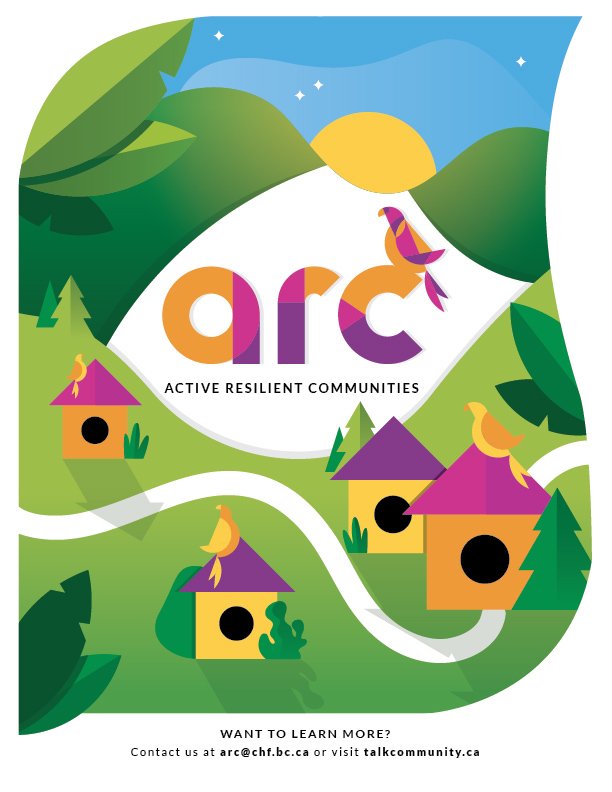
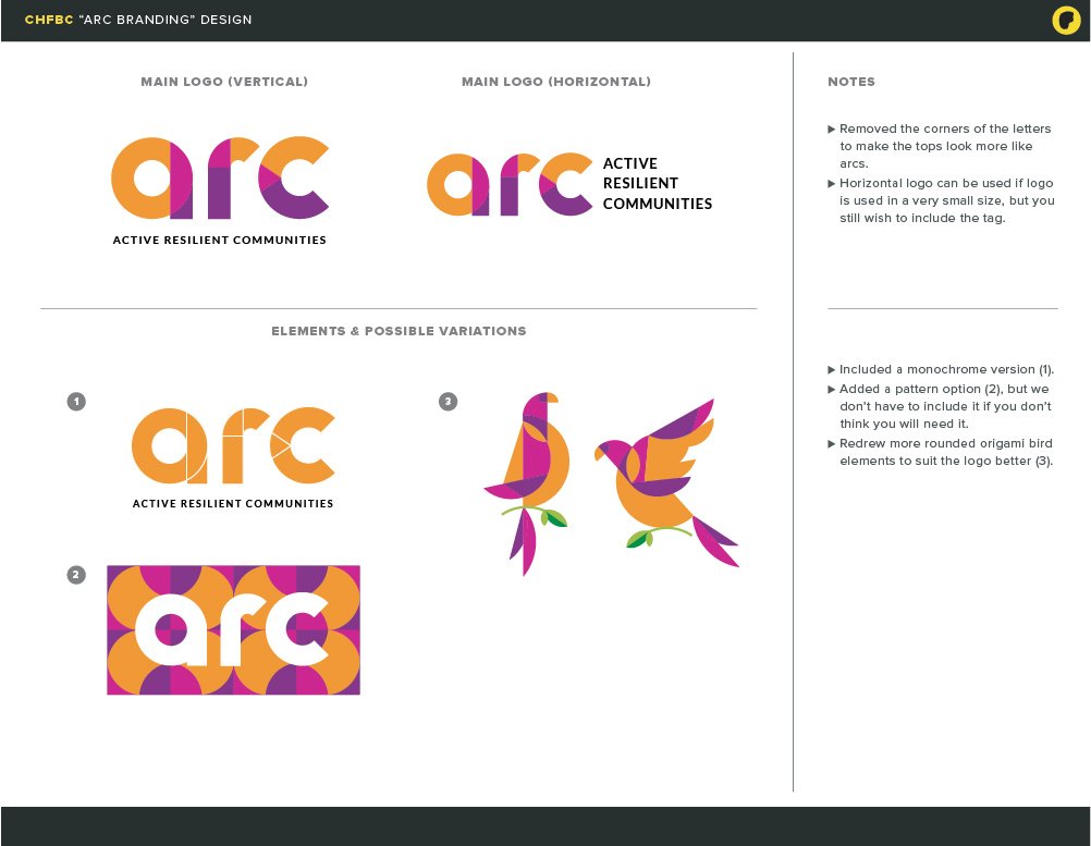
The Co-operative Housing Federation of BC needed to create a logo for their Active Resilient Communities (ARC) project. This program is designed to help their members have better conversations about issues they might have in their community. The branding had to be distinct, colorful, and had to convey the importance of coming together. The client also requested a “mascot” to accompany their logo and that could be interchangeable with the wordmark.
SOLUTION
I designed the ARC logo with different shapes making up the letters, signifying people coming together to make a whole, like a co-op. The client expressed the desire to have “arches” and rounded lines to allude to the “arc” name. These shapes were carried over to the ARC mascot, a parrot, to bring cohesiveness. I chose the parrot because they are communal birds and often live in large groups, and their feathers are colourful so we could take full advantage of the colour palette we chose.


